Duration: September 2025 - January 2026
Role: Interaction designer, UX, UI, research
Tools: Figma
Overview
During my internship, I worked on designing a new concept for a travel planner for Kalmar Länstrafik. The existing solution was identified as difficult to use, technically limited, and not aligned with modern accessibility standards.
The goal was to create an intuitive and responsive experience that allows users to quickly plan their journey regardless of device or context. By applying user-centered design principles, I developed a solution that simplifies complex information while supporting long-term scalability and maintainability.
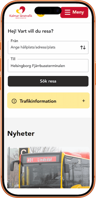
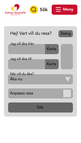
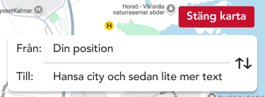
Existing interface
The existing solution suffered from poor usability, outdated structure, and limited accessibility.
My process
The project was driven by a user-centered design approach, combining research, analysis, and iterative design.
01. Research
User testing
Interviews
Competitor analysis
02. Analysis
Synthesized insights
Defined key problems
Understand user needs
03. Ideation & design
Sketching, wireframes, mockups & prototypes
User flows
UI exploration
04. Testing & iteration
User testing of proposed solutions
User testing and continuous improvements
Challanges and approach
The project involved addressing several challenges related to usability, accessibility, and system complexity. The main focus was to simplify a feature-rich service while meeting modern requirements for performance, scalability, and inclusive design.
01. Information overload
Too much information presented at once
Difficult to quickly understand and compare options
Lack of clear prioritization
01. Response
Prioritized key information
Created a clear visual hierarchy
Grouped related elements and reduced noise
02. Lack of accessibility
Did not meet modern accessibility standards (WCAG)
Low contrast and readability issues
Not designed for a wide range of users
02. Response
Designed with WCAG 2.1 AA in mind
Improved contrast and typography
Introduced clearer interaction patterns
03. Inefficient user flow
Too many unnecessary steps
Friction in completing simple tasks
Unclear navigation and structure
03. Response
Reduced number of steps
Simplified and structured the flow
Guided users through a clearer journey
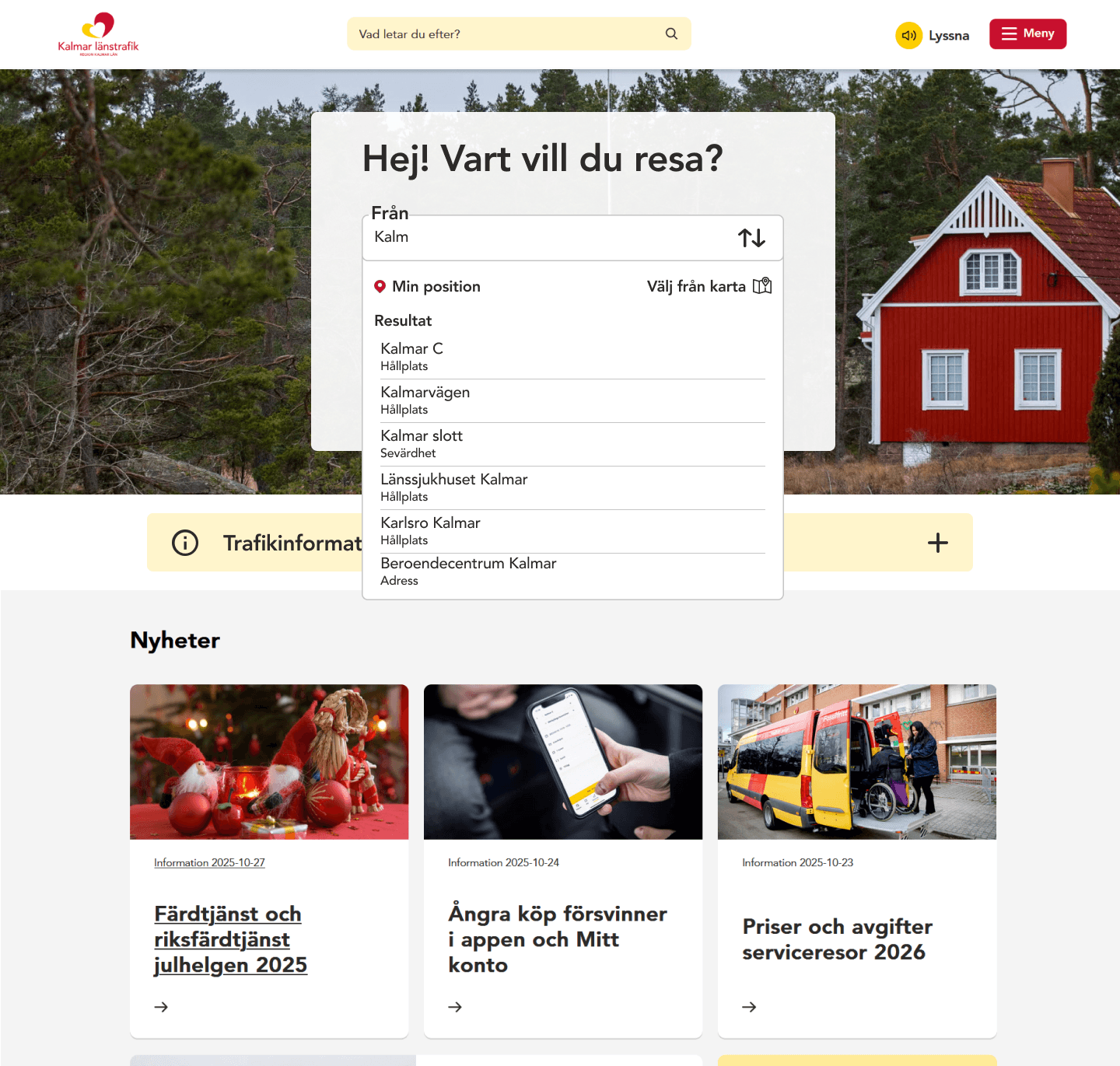
Early explorations and iteration
In the early stages, I explored different concepts and layouts to understand how the travel planner could be structured in a more intuitive way. Initial concepts focused on exploring structure, hierarchy, and feature scope rather than visual design.
Explorations
Exploring functionality
Initially, I experimented with including a wide range of features to cover multiple user needs. However, this resulted in a cluttered and overwhelming interface.
Layout and structure
I tested different layout approaches, including card-based and list-based designs, to find a balance between information density and clarity.
Key insight
These explorations made it clear that a more minimal and focused approach led to a significantly better user experience.

Iterations
Through iterative design, I refined the solution from a complex and feature-heavy interface into a more focused and user-friendly experience. Each iteration was based on insights from previous versions.
Iteration 01 - Trip details

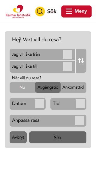
Iteration 02 - Search engine
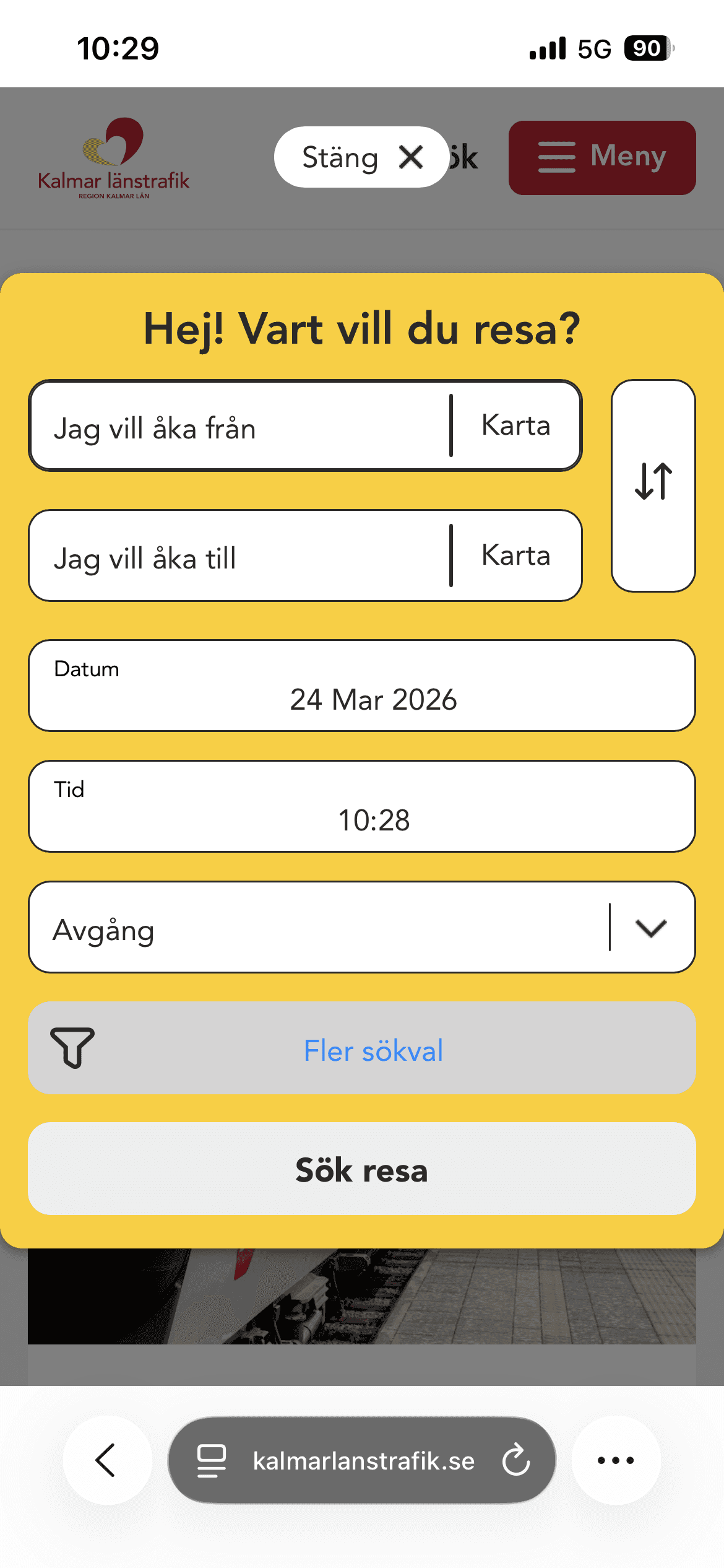
Problem: The search flow included too many options upfront, which created unnecessary cognitive load.
Change: I moved secondary features such as “select from map” and “choose time” to a later step, allowing users to first focus on selecting stations.
Impact: This created a more focused and intuitive flow where users can search first and refine their trip afterwards.
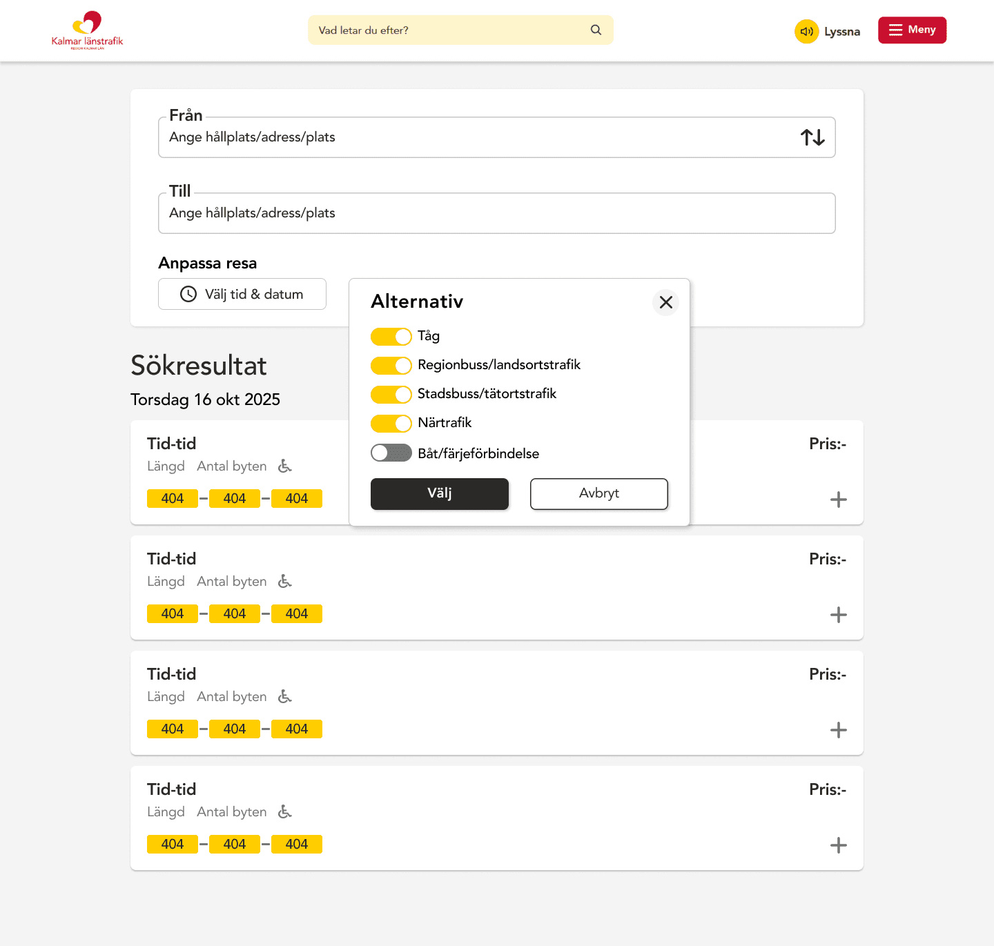
Iteration 03 - Map functions

Problem: The map view included too many functions, which made the interface feel cluttered and unclear.
Change: The search function was removed to allow users to explore and select stations directly on the map.
Impact: This created a more focused experience with fewer distractions and a clearer user flow.
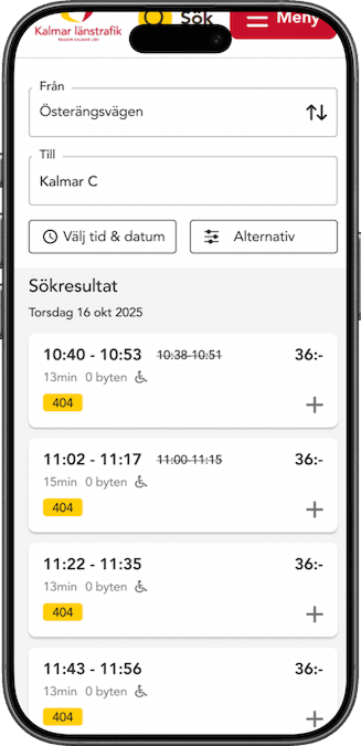
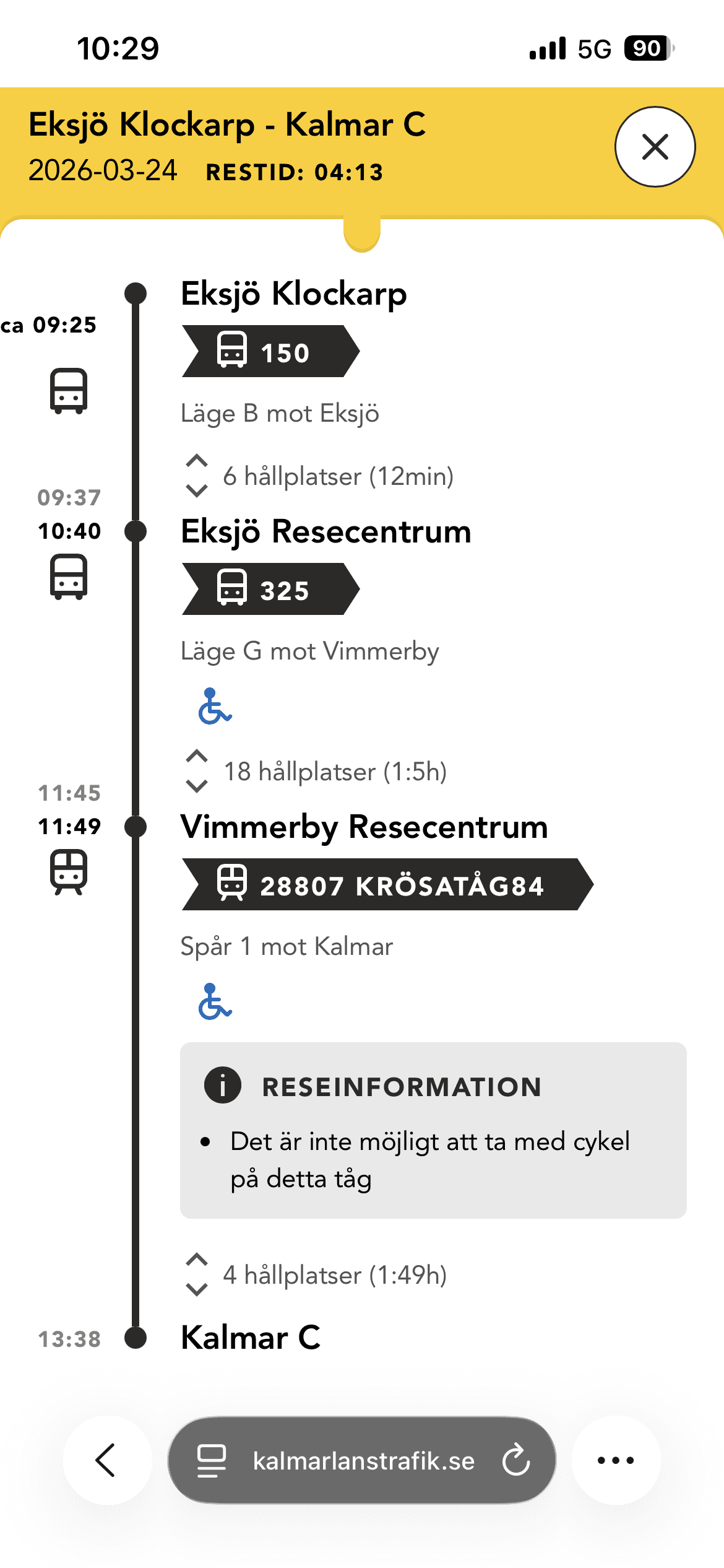
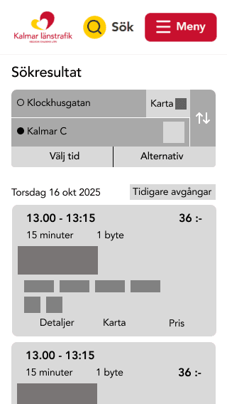
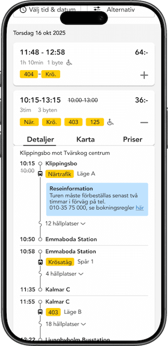
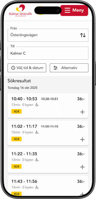
Final solution
The final solution is a responsive and accessible travel planner designed with clarity and simplicity in mind. By prioritizing essential features and creating a consistent design system, the solution improves usability while supporting future scalability and development.
Desktop
Mobile
Accessibility & clarity
Modern, scalable design
Clean UI with a structure that supports future features
Responsive experience
Optimized for mobile, tablet, and desktop
Reflection
This project provided valuable insights into how to balance user needs, technical constraints, and design decisions when working with complex systems.
Simplicity over complexity
Learned the importance of simplifying complex systems
Validated design decisions through user testing
Gained experience working in a real-world project
Designing with visual hierarchy
Learned to guide users with a clear visual hierarchy
Adjusted font size, color, weight and placement to create a natural flow
Made it easier for users to find and process information
Iteration improves clarity
Continuously refined structure and interaction through iteration
Reduced friction with each iteration
Moved closer to a clear and usable product